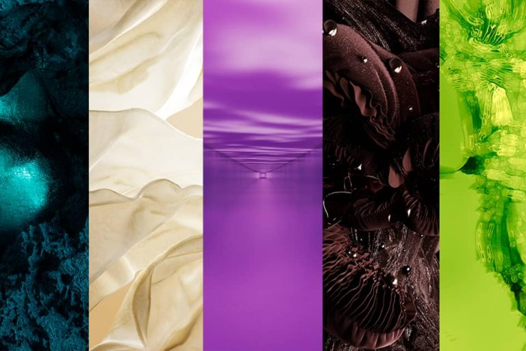
While all eyes are on the ongoing SS25 Fashion Week season, trend forecaster WGSN and its colour-focused sister company Coloro are already looking ahead to FW26/27. The duo have released their five key shades for the period, including the colour of the year, previously announced as ‘Transformative Teal’.
The selection was based on the overarching theme of “reorientation,” WGSN said, which challenges old ideas and seeks opportunities that call for urgent change. The lineup includes both “grounding” dark and “responsive” bright colors, reflecting the need for “balance, excitement and stability.”
Transformative Teal (092-37-14)
Transformative Teal, however, takes center stage. The shade, which sits between blue and green, was selected for the way it “emphasizes the importance of an Earth-first mindset” and further strengthens the connection between digital and terrestrial. It was described as fitting for the need for restoration and regeneration, driving the desire for solutions for our planet.
Sansan Chen, Managing Director of Coloro, said of the selection: “Coloro Feasibility Intelligence was used to determine that Transformative Teal is a highly feasible colour for all key textile substrates – both in terms of match and metamerism. It has good lightfastness and no major issues with other fastnesses. Brands should feel really confident in executing this key colour.”
Wax Paper (035-88-12)
This off-white, yellowish hue gives the overall color palette a calmer, more neutral look, bringing a warmth that WGSN describes as a “diluted winter sun.”
Fresh Purple (136-32-33)
Associated with royalty, love, mystery and spirituality, this shade of purple hopes to encourage the pursuit of a fresh perspective, with its ability to combine red and blue, further signifying “togetherness and unity.”
Cocoa Powder (008-35-06)
This red-brown hopes to evoke feelings of nostalgia, promote art, craft and manual work, while also emphasising the quest for slowness evident in an industry where technology is rapidly taking over.
Green Glow (057-82-32)
Cited as a “highly emotional, responsive bright color,” this yellow-green hue brings out mixed emotions of discomfort and excitement, while nurturing “a sense of escapism in everyday life.”
This article was translated using an AI tool called Gemini 1.5 .
FashionUnited uses AI language tools to speed up the translation of (news) articles and proofread the translations to improve the end result. This saves our human journalists time that they can spend on research and writing their own articles. Articles translated with the help of AI are checked and edited by a human desk editor before they go online. If you have any questions or comments about this process, please send an email to info@fashionunited.com.


